LIMEPAY
Building a brand-first, embedded finance solution
Building a brand-first, embedded finance solution
During my tenure at Limepay I was the Lead Product Designer responsible for their core product offering; the end-to-end user experience of the STACK checkout and user dashboards.
STACK is a white-labelled, embedded finance payment platform. Customers can pay now or pay later all under the merchant’s branding without leaving the Merchant’s checkout. Whilst initially offering a buy now pay later solution, the product diverted to a SaaS model with a wider spread of payment methods.
Our design solutions pre-empted the ever-evolving AML and KYC regulatory obligations of the industry.
Please read below for details on:
Please click here to visit the live website:
View WebsiteEnd-to-end Product Design
Competitor Analysis
Affinity Mapping and User Journeys
Service Design
Rapid Prototyping
User Research and Usability Testing
UX Writing
2020 - 2022 at Limepay
I worked side-by-side with these legends:
James Hunt, Head of Product
Andy Britz, CTO
Cail Borg, Lead UI Designer
Tim Sotiri, Lead Front-end
Sean Policarpio, Lead Back-end
Deb Jagadeba, Head of QA
The majority of my process is centred around diagnosing problems and testing how well solutions solve those problems, rather than the ideation of the design solution itself. Without properly identifying the problem to be solved, any subsequent design solutions run the risk of being ineffective.
As the first full-time UX hire at Limepay, my first self-initiated task was to understand the existing end-to-end customer experience.
I began by formally mapping the information architecture and UX flows of the Limepay checkout artefacts, compiling service design maps of all customer touch-points and associated backstage integrations and processes. From here I had the groundwork for diagnosing pain points and identifying opportunities for improvement or new product features.
I performed competitor analysis to widen my understanding of the market and helped the team identify our point-of-difference as well as discerning design patterns that consumers found familiar and were comfortable interacting with.
Interviewing internal stakeholders allowed me to get a better understanding of Limepay's goals, customer needs, and competitive landscape. It helped inform decisions such as which features to prioritise and where to start further investigations. I held interviews and workshops with the following teams;
Mapping BNPL consumer experience from checkout through to payment plan completion
Limepay's default rate for payment plans was higher than the industry standard meaning an increase to the losses that Limepay had to take on.
Lowering default rates would help Limepay remain solvent and profitable, whilst also helping ensure that Limepay is responsibly lending money to borrowers.
In team workshops, we identified multiple areas across the customer lifecycle that we could improve. We articulated pain points in the user journey that were most problematic for pay plan users by analysing data on default rates and verbatim feedback from customers reporting issues with our CS team.
Affinity mapping helped us categorise these findings into a summary of our findings.
One of many white boarding exercises
Mapping user journeys
Mapping B2B user journeys
Affinity mapping exercise
Now that our problem with clearly defined and the project goals were established, our team refocused our energy on brainstorming ideas and solutions, and I began sketching user flows, creating wireframes and prototypes, before conducting usability testing.
Brainstorming sessions included "How might we" exercises; a great tool for creative problem solving as they encourage teams to think outside the box and view problems from a different perspective in an environment fostering innovation and creativity. Examples of questions we posed can be found below.
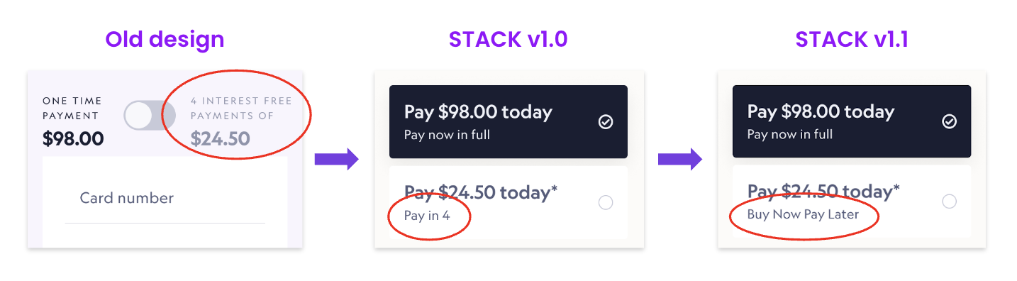
A key upgrade we made was making sure we were granting loans to the right people in the first place. We updated the rules that ran the classification system of our risk engine as well as introducing credit checks and advanced ID checks in our KYC and fraud analysis.
It was important that we made customers' financial obligations clear upfront during the checkout process. We updated the tone of voice of all UX artefacts so that they were easily understood, especially as the majority of our audience were from a younger demographic and were less financially literate than older demographics.
Updating the schedule and content of payment reminder eDMs and SMS meant that customers would receive clear instruction of the automated instalment process at more opportune times.
A new self-service payment feature in Customer Dashboard allowing customers to pay flexibly at times that better suited them.
As regulatory changes evolved, we needed to update our KYC processes. These were mapped as below.
The KYC process was a tiered, cascading structure aimed at giving low risk customers the least amount of friction. Users who were pre-verified by our merchant partners or customers who had previously completed these identity checks could fast-track this process for a quicker, more seamless experience.
High risk customers experienced more friction, with extended screening including ID document information.
The KYC widget enabled us to provide different combinations to different countries or industries with higher risk profiles.
KYC UX flow
I unpacked 27 different use cases for our Australian B2C customers, depending on the payment method they selected, shopping history and their risk profile. These use cases helped inform QA
User journeys by different use cases
Example in situ KYC flow
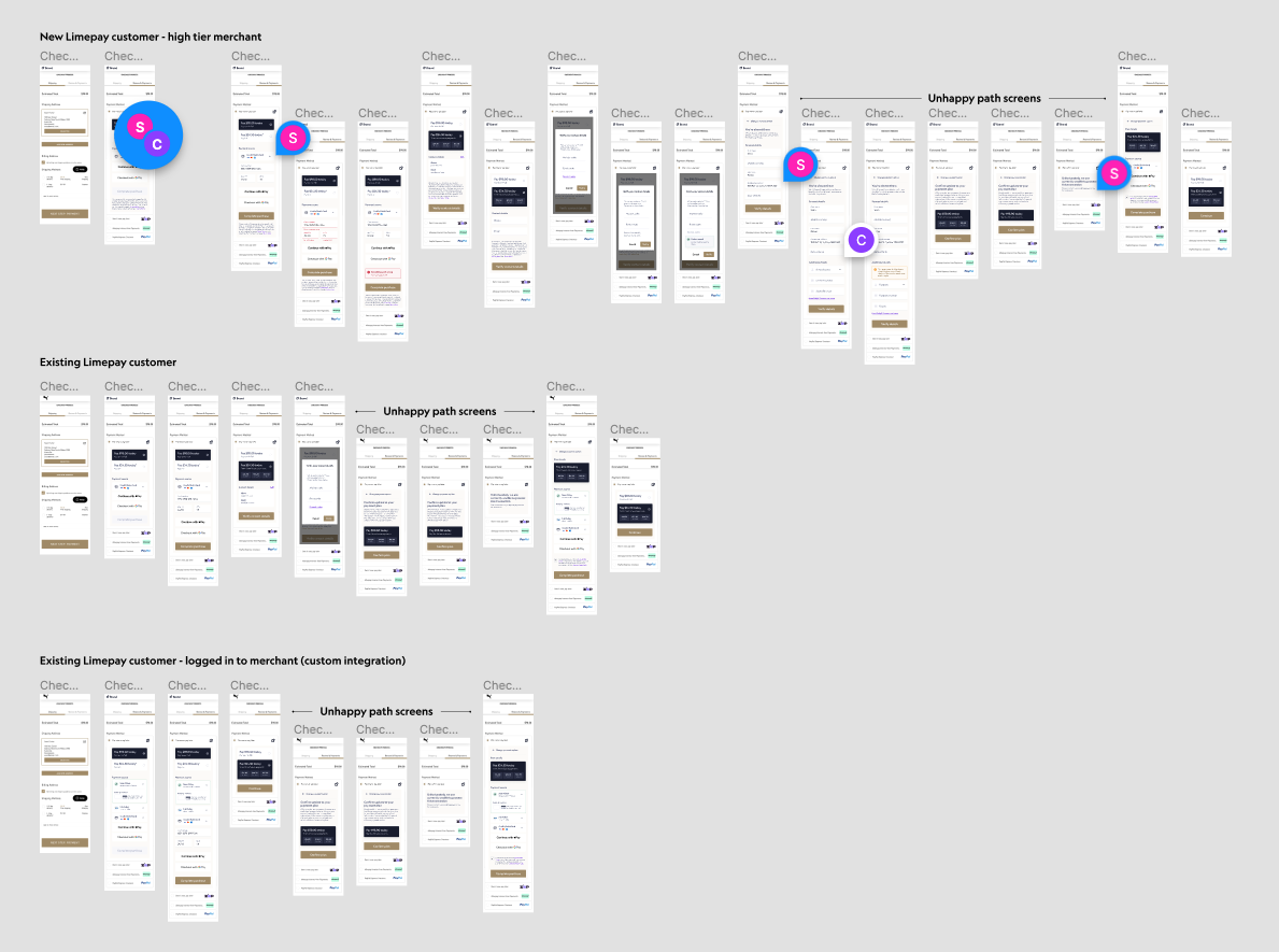
High fidelity designs with unhappy path display options
During my tenure I championed and established research and user testing protocols. I ran the first pilot research project, illustrating the value and importance of these rituals in our product practice by showcasing the design updates we made as a result of this testing.
With a budget that was limited, I collected qualitative and quantitative data to inform product decisions and design solutions. We leveraged UsabilityHub to perform our initial research; a great tool with a low barrier to entry. We could access their panel with a wide range of demographic targeting whilst we built our own.
By performing research we uncovered product issues and opportunities early, preventing wasted resource time, effort and user frustration.
Research was grounded on short, quick, easy tests to gain meaningful and relevant insights for product validation and identification of opportunities, pain points and areas of improvement.
Research initiatives included;
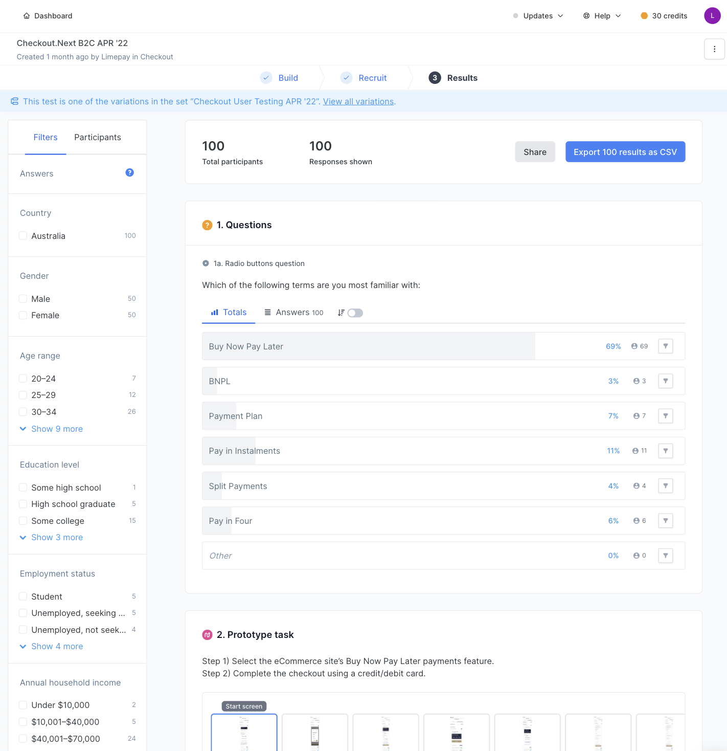
Screenshot of Usability Hub survey results
Heat maps quickly revealed areas of the checkout that were drawing the most attention, as well as those that were being overlooked. Comparing visual representations of user interactions and engagement between design iterations meant we could easily identify problems and optimise our layouts to help improve the user experience.
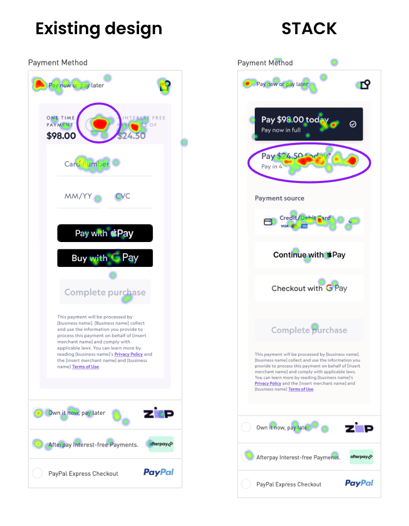
Heat maps of old vs. new design layouts
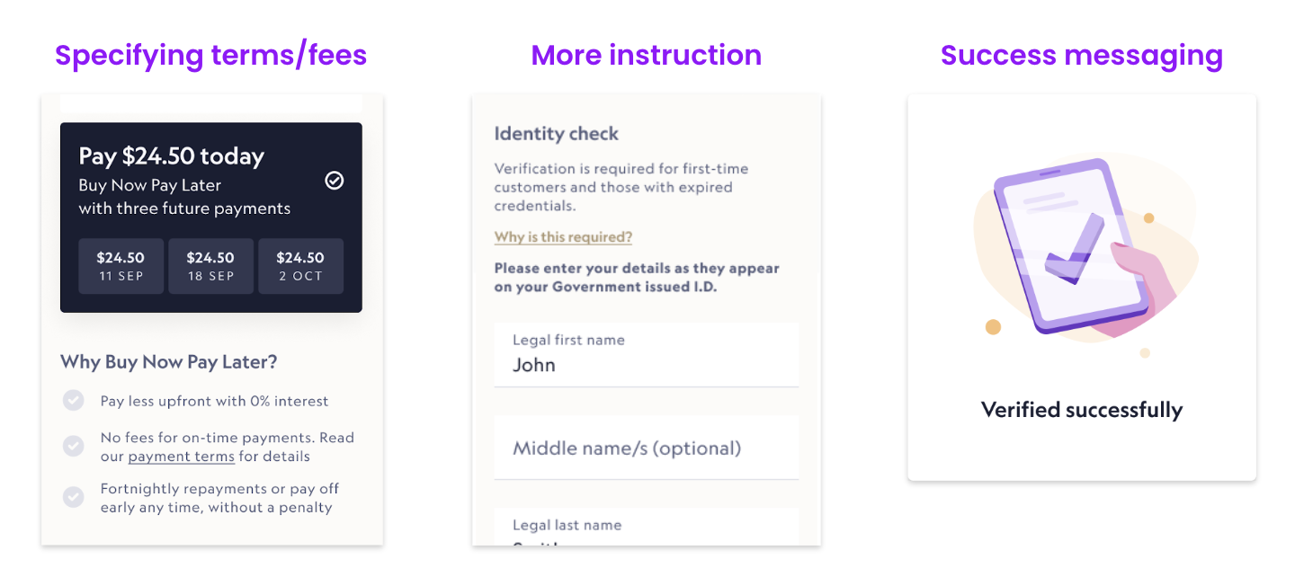
Research uncovered a need to be more transparent with pay plan information like payment terms, instalment amounts and associated fees and charges.
Additionally, users desired more casual, relatable language for improved comprehension. I worked with the Legal team to update disclaimers and copy to be more colloquial to better suit the younger demographic of our customers.
We also provided more content explaining the payment plan details upfront as well as providing success messaging along the checkout journey so users were clear that their application was progressing.
Design updates post user testing feedback
Whilst copywriting is not my forte, this role fell in my lap because of our lean team. I was responsible for updated UX writing in all customer comms and within the customer dashboard self-service modals.
User research revealed a preference in language and layout making our new design update more intuitive to customers.
Design and language iterations following user research tests
Interviews with existing customers revealed a discrepancy between when customers received reminder comms for future instalments and when they felt they needed them. Reminders were sent too far in advance and didn't contain enough information for customers to feel informed of their obligations.
We updated the schedule that comms were sent (email and SMS) and tailored content within those artefacts to better suit the stage of payment. Language was also updated to reflect the colloquial tone used in the updated checkout experience.
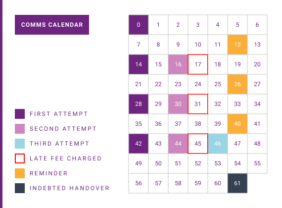
Updated comms schedule
Pay plan instalments are processed on a fortnightly automated schedule. Customers are unable to make payments outside of this automated process. This can result in missed payments that incur late fees and they are frustrated from lack of payment flexibility.
200 customers contact our CS team regarding manual payments weekly, equating to over 10 hours of support time per week.
Providing product flexibility with self-service payments which gives customers more control and requires less administration from Limepay support staff. This impacted existing customer dashboards and comms artefacts.
We identified the following use cases to solve for:
We ran usability tests on wireframe prototypes throughout multiple stages of the process to validate our design solutions and make product decisions. For example; the results of a usability test decided how we applied outstanding balance to the remaining payment schedule.
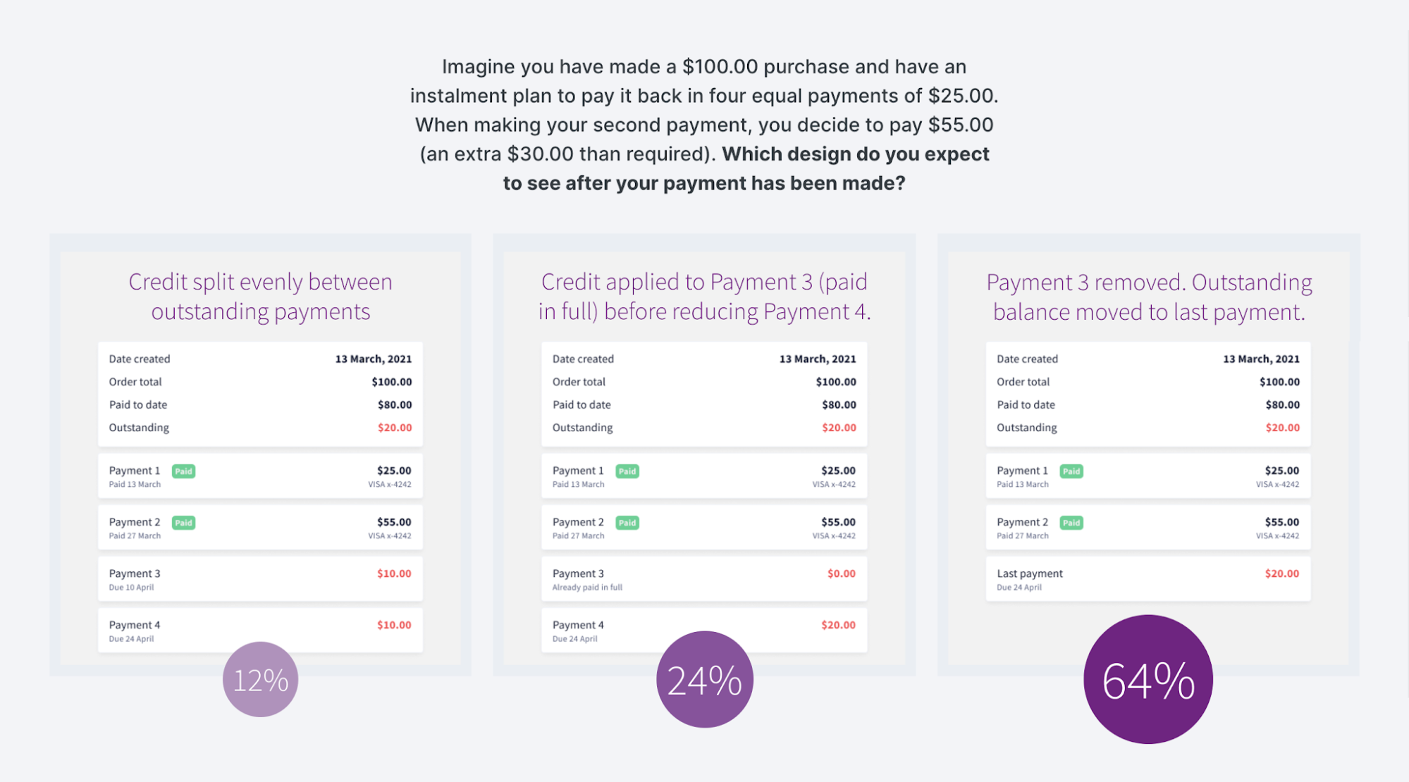
Results of user preference test

Overview of self-service payments feature interactions
High-fidelity clickable prototype of self-service payments feature
By understanding the customer experience of the checkout and post-purchase actions, I was able to make meaningful improvements. The changes I implemented resulted in a better customer experience, increased customer satisfaction, and more efficient processes for both them and our customer support team.
Defaults dropped by over 82% and support requests dropped by 35% as a result of these changes.
Although the design goals were successfully met, our assessment of these updated features remained an ongoing process. Some other rituals we performed post-launch included;
By continually refining and improving the product over time we can ensure the best user experience that meets the needs of our ever changing audience.
Contact me for human-centred design solutions suitable for your business.
Get in touch